Previously, I wrote a post about 10 Tips for HTML Email Marketing which provided some helpful tips on how to prepare a successful email campaign. After designing a few email templates recently, I thought it would be good time to revisit the subject of HTML emails and focus on responsive email design.
If you’re not familiar with responsive design, it is the method of developing websites in a manner that allows them to adapt to the many different devices. Considering that more and more people are using phones and tablets to check their email, we need to make sure our emails look good on a plethora of different devices.
56% of total email opens occurred on a mobile phone or tablet in Q4 2015, compared to 54% in Q3 2015. – Experian “Quarterly email benchmark report” (Q4 2015)
The ultimate mobile email statistics overview
Let’s face it, designing an HTML email is one of the most least favorable tasks for any web designer. It’s like stepping back into the late 90’s and coding basic layouts with tables where you feel helpless…trying to hack it any way you can in order to make it look good across multiple platforms.
How It Works
Responsive email design makes use of media queries (@media) to target different breakpoints for device screen widths. This allows us much more flexibility when we want to style our content for different devices.
Media queries in emails work just like they do for the web (depending on the user’s email client), and are included in the head of your document. Media queries are constructed of three parts; the media type, an expression and the conditional CSS.
@media screen and (max-width:525px) {
         table[class="wrapper"] {
         width:100% !important;
     }
}
Why would we want to do this? Maybe we would like to customize the mobile version by hiding an image, tweaking button sizes or formatting the call to action to better fit the screen dimensions. While it does require more code, it allows us to present our content in the best way possible.
Stacking is your friend when it comes to mobile email design! Designing a one column layout is a lot easier to control the display in different email clients, but if there are multiple columns, you can code them to stack for mobile devices.
Where to Start
There’s no need to reinvent the wheel. Save time and start with a template that has a proven, well-tested structure. If you prefer to code your own email template with a structure that is already established, here are a few places that offer bare bones templates which allow you to take full advantage of a solid foundation.
Not up for the challenge of starting with a bare bones email template? You can always use the WYSIWYG editor that is built in to your email blast provider.
Design Process
When designing your email, keep in mind the restraints you may be faced with due to email client rendering engines. Since there are many limitations, keep it simple and focus on your message. Approach the design with a mobile first mindset, then expand the design to a desktop version. Considering that the majority of our recipients will be viewing the email on a mobile device, let’s cater to them first.
A number of free email templates come with Photoshop files. If the template you are using came with a PSD file, use it as a starting point and work within the structure already established. If your content isn’t fitting vertically into the provided space, just make that section a little deeper, but avoid trying to change column widths that are already in place.
Preheader Text
Preheader text is often overlooked in email design and makes for messy message previews. This is the text that you see just under the subject line on your mobile device. It helps the recipient understand what the email is about at first glance and helps spark interest into opening your message. Get creative and don’t just repeat the subject line.
Images
Fluid images make email designs much more appealing. Use a max-width:100%; on your images so they scale to the max-width of the device. If someone is viewing your email on a mobile device and your image is not set to use the max-width declaration, the email wrapper will extend past the viewport of the device, making it so that you have to scroll left and right to read the whole message.
Keep in mind that if you are using a WYSIWYG editor, not all builders will add max-width:100%; to images that you want to have fit the viewport width of mobile devices.
Testing
The most important thing that I can stress is testing! After designing and coding your email and sending it to your list, the last thing you want to find out is that it did not render properly.
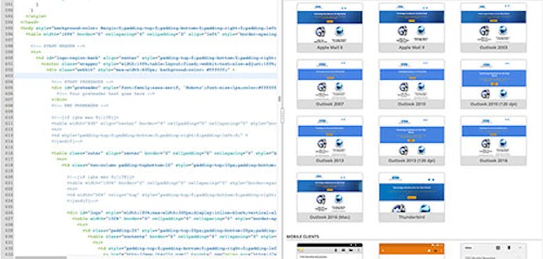
A great resource for testing screen previews is Email On Acid. Email on Acid provides a robust toolset that allows you to code in a visual editor with real-time previews, and also generates screenshots of your email and how it would look over 50 different email clients just by clicking the reset button. In addition to the real-time preview and screenshots, it also has a great code analysis tool that flags unsupported HTML and CSS in emails.