Web design, development, and content (SEO) are the three major parts of a website. And although they’re all interconnected, they are generally focused on in that order when a new site is being created. First, the site is designed, then it is developed, and finally, the content is added. But, the design aspect of building a website is often overlooked by people who aren’t “in the know.” They understand that their website should look nice, but why should it look nice? And how is it made to look nice?
There are three aspects to a first impression that your site needs to nail in order to land a visitor. You need to entice them to your site with your SEO title and meta description, your site needs to load quickly, and your site needs to be easy to use and nice to look at. Today we’ll be exploring that final piece of the puzzle by answering some of the most common questions regarding web design.
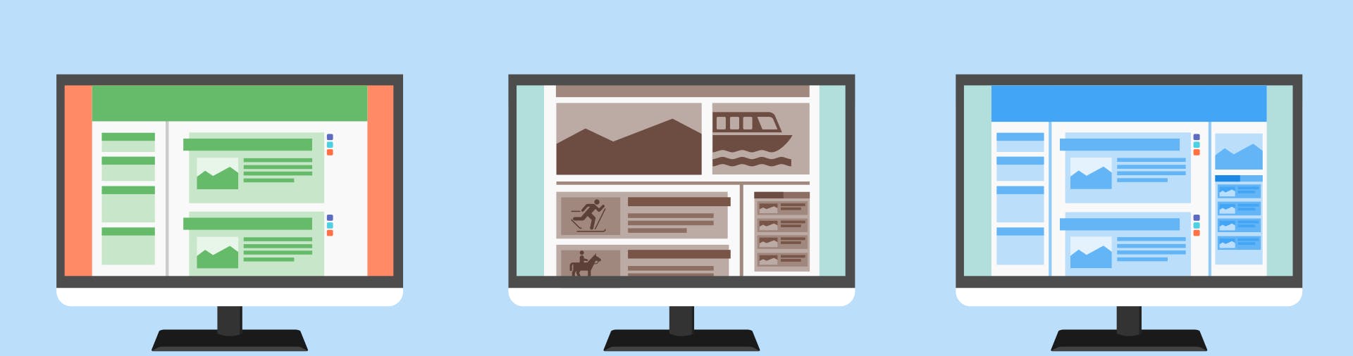
What is the Most Common Website Screen Size?
When designing a website the screen size which the site is “designed for” is 1920×1080 pixels. This is the most common, and typically largest, desktop screen size, so it’s used as the baseline. Using these dimensions, we have a good understanding of where the “fold” (where the bottom of the screen cuts off the page) will be for the majority of site visitors. It’s also much easier to downscale to smaller screen sizes than to upscale to larger ones.
You can think of a web page as an image. If you scale up an image it gets blurry, but if you scale it down it’s generally going to be okay. With a website, if you scale it up then elements can become too large, or there may be too much white space. But scaling down is typically done by simplifying and streamlining the full-size site.
And although the site is first designed based on the 1920×1080 screen size, a responsive design means it will still look and function great no matter at what size or dimensions it’s viewed.
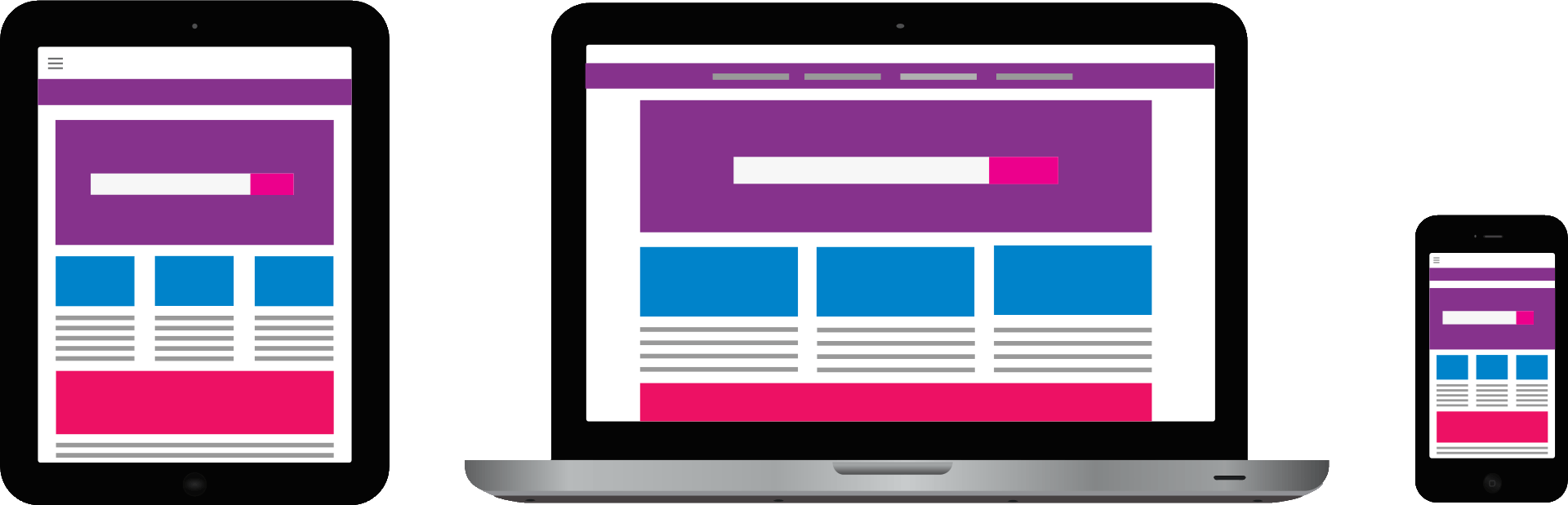
What is Meant by Responsive Web Design?
Responsive web design refers to when the page layout and design elements adjust for different screen sizes and dimensions. This ability for a website to be easily viewed on any number of devices is a necessity for modern websites. And while some sites still opt for adaptive designs or mobile URLs, responsive design is the most popular solution to this problem.
Generally speaking, the smaller the screen your website is on gets, the more simplified the site should be. This is done in a number of ways, such as reducing the overall screen width, altering the sizes of text and images, and streamlining site navigation. However, even with all of these changes, the “character” of the full design should still exist. It’s the same site, but it’s responding to the change in screen size.
If you’re looking for an example of a responsive design, look no further than mediaproper.com. If you’re reading this on a laptop or desktop right now, then you can test out our responsive design for yourself. Put your browser in windowed mode, and then drag one of the sides in towards the other to make the viewable screen more narrow. You’ll notice that the text never gets cut off but instead is reformatted to fit the adjusting screen size. Additionally, once your screen size gets to a small enough point, the images will fall into a single column with the text rather than being off to the right.
What is the Difference Between Responsive and Adaptive Design?
While responsive designs respond to the change in screen size, adaptive designs adapt to different screen sizes by serving screen size-specific versions of a web page. So why does this matter, and which option is better?
The first thing which should be mentioned is that all websites created by Media Proper are responsive. From our experience, responsive designs are the preferred method of screen resizing because they provide a fluid and natural experience for users across all screen sizes. With adaptive designs, this simply isn’t the case. Either you’re visitors are viewing the desktop version of your site or the mobile version — there is no in-between. This means that if they’re on a desktop, but aren’t using a standard screen size, your site will not display properly.
The Home Depot’s website is an example of an adaptive design. If you go to their site and then resize your browser, you’ll notice that it begins to cut off parts of the page rather than resize it. However, if you view it on a mobile device, the page won’t be cut off despite the screen size being smaller — and will actually be structured differently. For all intents and purposes, websites that are adaptive have two (or more) versions which are served depending on the device they are viewed from, while responsively designed websites have one version.
There also used to be a trend of having a subdomain for mobile versions of adaptive websites. For example, instead of www.homedepot.com, the mobile version would be www.m.homedepot.com. However, this isn’t necessary anymore, and The Home Depot’s mobile site doesn’t utilize a subdomain. In fact, it was surprising to find that their site is still adaptive. Most of the sites found on lists of adaptive websites have since been updated to responsive designs.
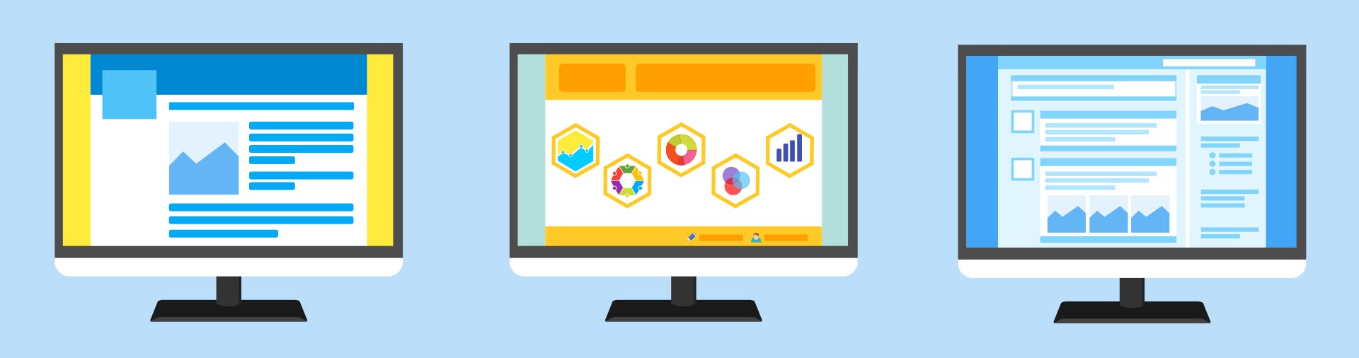
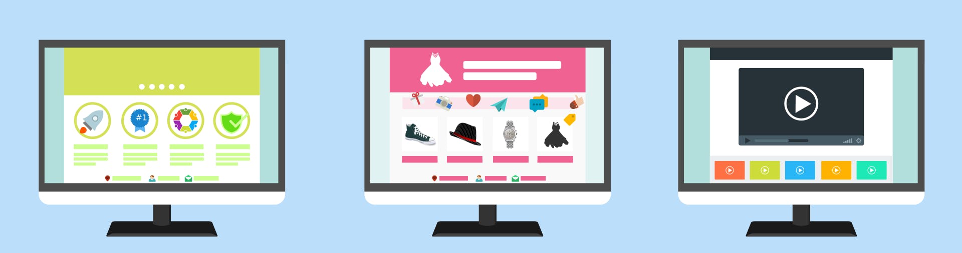
What is the Best Website Layout?
It’s difficult to say what the “best” website layout is. But there are a couple of key elements and features that any good site needs. There should be a clear call to action above the fold, neat typography, enough padding and “white space,” a good color scheme, easy navigation with quick access to relevant information, plenty of high quality imagery, and a responsive design. If you can check off each of those elements for your site, then you’re probably in good condition. And remember that these features should apply to your site regardless of what size screen it’s viewed on. Even if someone is on a mobile device, your site still needs things like padding and easy navigation.
Check out Awesome Foods (one of our clients) for a great example of these elements in action.
Web Design by Media Proper
When it’s time for your website to get a fresh new look, contact Media Proper. Our in-house team of web designers and developers will craft and code a site that incorporates all the latest “best practices.” We look forward to giving your site the makeover it deserves.